Search, Navigation, & Add-ons, oh my!
How Simplify v2 wrangles everything around your content.
“Like Lucky Charms spewed all over the screen”
Gmail’s chrome is a sea of icons and buttons that take up too much space and distract from the primary content. Adam Barker, an old friend and ex-Gmail designer, used to compare this kind of design to Lucky Charms being spewed all over the screen.
To be fair, the above screenshot is an extreme. You can minimize the navigation and hide the add-ons if you don’t use them. This increases the amount of screen dedicated to content, but the nav is still a long string of icons with demanding red badges. And then the content is stretched across the screen, making it harder to read despite fewer distracting icons. This might be worse:
Simplify v1 addressed this by:
Merging the app and action bar into one bar
Hiding the navigation completely when it is minimized
Condensing the add-on tray to a single button so you don’t have to hide it
Applying a maximum width to the content so that white space can envelop and highlight what you are reading
But, there are a number of flaws in Simplify v1’s attempts to fix all these things.
One example is how Simplify v1 merged the app bar and the action bar. Wedging the search box into the upper-right corner makes for a search box that is too small and prone to breaking when Gmail changes. I have never thought this was the best design, just the best design I could provide given Gmail's DOM (how the interface is structured in the code).
I’ve sought to address this and other issues with Simplify v2 to make Simplify better in all regards.
Search, front and center
For starters, the search box is now large and centered:
To achieve this, the search box is minimized to a single button on the right when you select or open a message.
The same applies in a conversation:
In the vertical reading pane, I moved search above the list and the actions above the message. Search is never minimized as you select or move between messages.
Navigation quick access on hover
It is nice to have the left navigation fully hidden but it is also harder to access. Gmail has a nice solution for this: you can hover over any of the icons and the nav peeks open so you can use it and automatically closes once your mouse leaves the area. My only complaint is the transition is a bit sluggish.
Simplify v2 brings this functionality back via mousing over the menu button and instantly showing the nav (no transition needed):
I expected to like this hover interaction but was surprised how much I liked it. The nav is much easier to use and keep minimized. The GIF doesn’t do it justice — you’ll have to use it and see for yourself.
Dim the navigation in conversation view
I like how Superhuman hides the navigation when you open a message for total focus. I tried this with Simplify v2 but the testers did not like it. At all. So instead of hiding the navigation, Simplify dims and hides the unread counts instead. Hovering over the nav brings it to full opacity and unhides the unread counts.
Bringing back Purchases, Finances, and Trips
Google Inbox had three more categories that Gmail did not bring over: Purchases, Finances, and Trips. Gmail decided to lump a lot of these into Updates so they could fit all the categories as tabs at the top of the default inbox.
Under the covers though, the categorization of email into these buckets is still happening if you know the secret search. Simplify Gmail v2 brings these back! Still missing is grouping emails into specific trips, but other than that, hello old friends.
Chat, it’s own thing
I’ve also moved chat out of the nav and into its own button. The full roster is exposed when you hover or click on the Hangouts button.
Two things to note about chat:
There is a setting to keep chat in the nav for easier access if you prefer.
This may have to be rethought with the swapping of Hangouts for Chat and Rooms.
App bar & Add-ons: fewer buttons with easier access
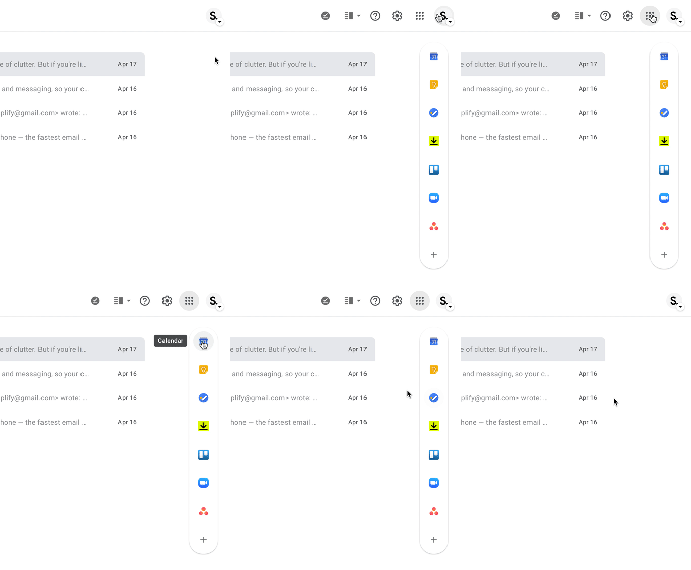
Lastly, Simplify v1 has a hodgepodge approach to dealing with the various icons in the app bar (Settings, Help, App Switcher, Offline, Reading pane toggle, and any number of 3rd party extensions). Some are removed, some hidden, some moved, and some left alone.
Likewise, while moving the add-ons tray into a single icon above compose was elegant, the implementation is a bit hard to use, as the tray closes as soon as your mouse strays off the narrow tray.
Simplify v2 remedies these shortcomings. The entire app bar and the add-ons tray are all accessible by simply hovering over the profile image in the top right.
Bonus round: Menus can look nice too!
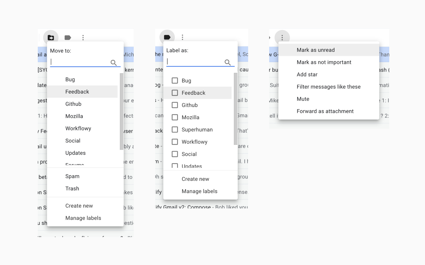
One of my early projects as a Gmail designer was redesigning labels. We elevated labels out of the More menu into a “Move to” and a “Label as” menu that still exist today. But somehow over the years, the visual design of these menus and Gmail menus in general have eroded.
Things don’t line up. Large left gutters are always applied. The highlight is full bleed except when it isn’t. Death by a thousand cuts. It eats at me.
So I fixed them. And I applied the improved style to all menus in Gmail.
Sometimes it is the little things. ☺️
Much better, but still more to come
All of these changes add up not just a better experience but a more reliable experience across the many unique Gmail setups (well over 2,500 by my calculations). Soon you will be able to try it out for yourself and let me know what you think.
There are a number of things that are still on my to do list for Simplify v2. Some will make the initial launch but most will have to wait until v2.1 as I don’t want to delay shipping v2 any longer than I need to.
Change the “Add to tasks” icon so is more distinct from the Snooze icon
Show more Snooze options either from past or settings
Let you hide actions you never use
Add a sweep action that lets you archive lots of messages at once (likely in a future update)
Add the categories from Inbox back to Gmail as they still work (Purchases, Finance, and Trips). Trips is all your travel related email, not the individual trip bundles in Inbox.
Saved searches (they won’t have unread counts in the nav like labels, but I think easy access to complex or often used searches is useful even without them)
If someone forwarded this to you and you liked it, you should subscribe to hear more about Simplify! I don’t post that often and you can unsubscribe at any time.


Thanks for taking time and getting this up and running. I have been using it for a while and I honestly love. I thought I would contribute with my feedback as I have been reading some of the comments. I have seen a lot of the people complaining about the price model and I would like to se an option to buy a lifetime license, similar to Plex offers. I know this could be a strech but I thought this could be a great option. One more thing that I miss of the old Gmail is a shortcut to "Move To" or "Label" email. Something we could quickly while reading the email maybe Press CTRL + M and move it to a folder or CTRL + L and label as something.
With selection I love the fact you can CTRL + A and select All messages. Maybe you could incorporate something like CTRL + 1 would select the first email at the top, CTRL + 2 the second and so on. This could be ready handy as I receive my emails from different teams I would love to have this as an option so I can label mu more quickly using keyboard.
Thanks again for this amazing addition to the clunky Gmail design.
Would love to see sort. Filter has its place, but I still end up going to the outlook client for sort, which creates it's own set of problems. Is this on the feature roadmap?